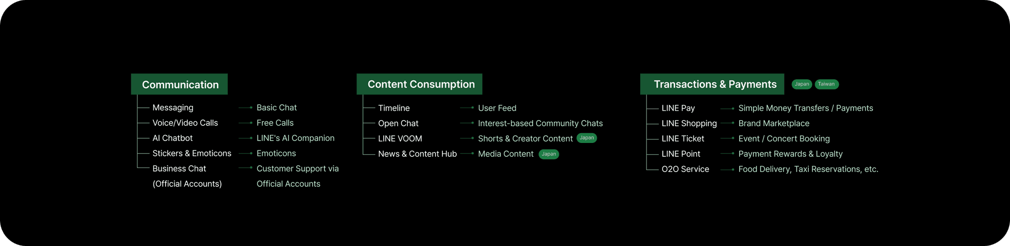
LINE Analysis Project
redesign

Project
Case study
Period
Apr 2025 - Mar 2025
Contribution
Research, UI Design
Overview
Mobile
UX Research • UI Design
2025

Ease of Use with Minimal Effort
#Accessible
Can both novice and experienced users operate it smoothly?
#Consistency
#Intuitive
Is there consistent structure and expression across the service?
Can users easily understand it without needing guidance?
Simple and Concise Information
#Relevant
#Clear
#Efficient
Is only the necessary information displayed on each screen?
Are menus and icons clearly associated with their functions?
Are the most important elements prioritized on each screen?
Preventing and Recovering from Errors
#Minimizing Error
Recovery Options
Does the service prevent situations
where users might make mistakes?
Are buttons for actions like
canceling clearly distinguishable?
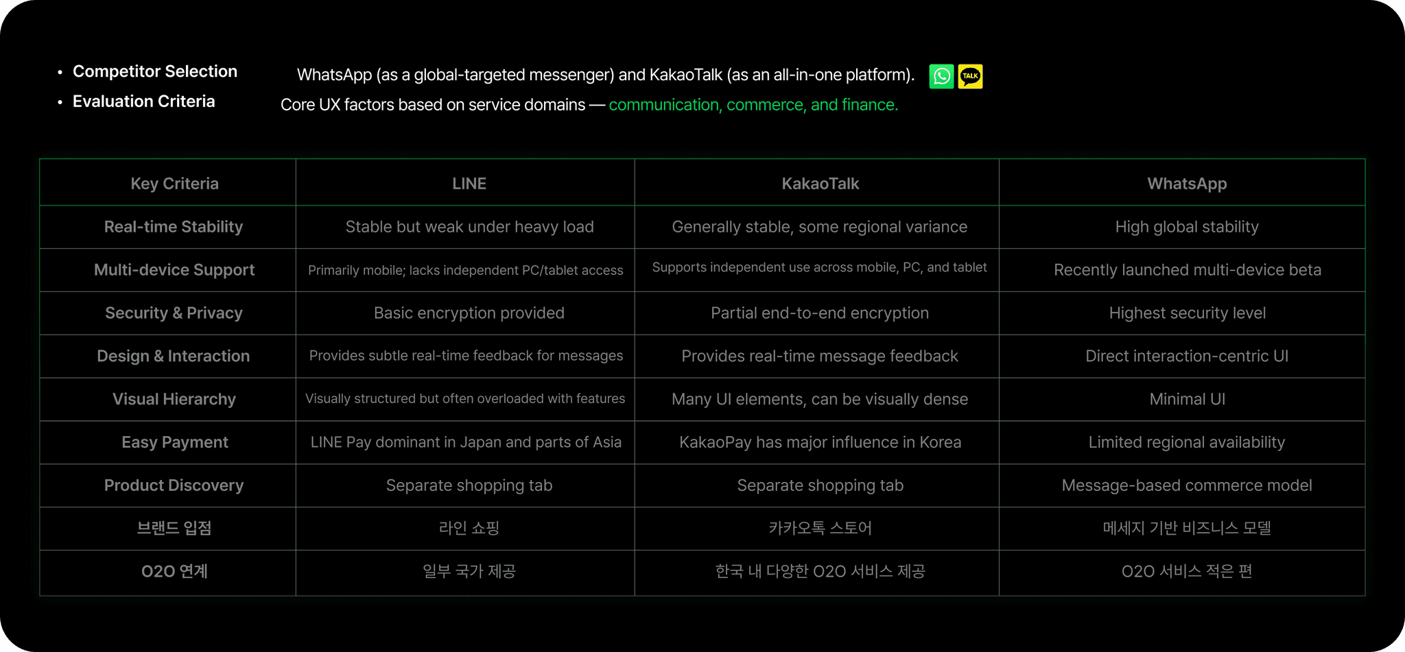
Evaluation Criteria
Participants: 3 people
(2 Koreans in their 20s and 1 Japanese)
Evaluation items: 8 categories
Screens evaluated: 65 screens


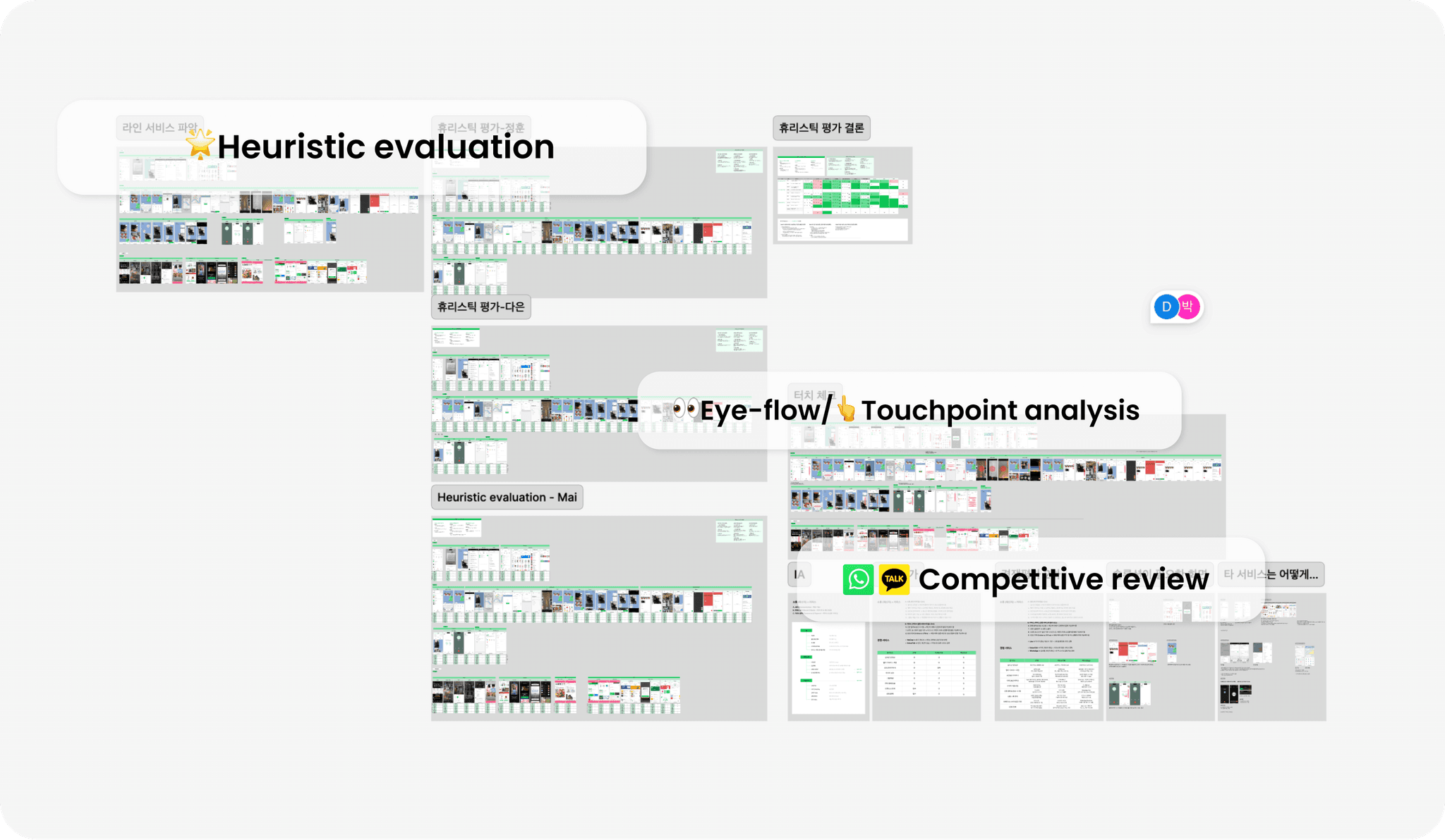
Analysis 01. Heuristic Evaluation
I created a heuristic evaluation standard tailored to LINE and
conducted evaluations with three users.
There is a need for consistent screens and efficient, intuitive information layout.
Analysis 02. Eye Tracking & Touch Flow Analysis
I analyzed visual attention and touch flow based on the user’s visit purpose and
predicted actions across all flows.
Screens that caused unnecessary touches or
disrupted visual flow due to inconsistent hierarchy were identified and analyzed.
\Improve with consistent layout, reduced touch flow, and clear information hierarchy..
Analysis 03. Competitor Benchmarking
I analyzed competing apps (WhatsApp, KakaoTalk) to identify
each service’s strengths and weaknesses.
IA
LINE Analysis Project
Project Category
Personal Project
Project Period
25.03 ~ 04
Implementation Level
Research 100% – Analysis 100% – Redesign 100%
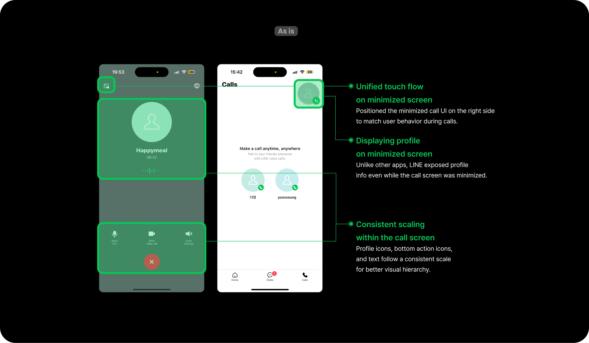
Disjointed call UI with limited context
Before
LINE Analysis Project
Project Category
Personal Project
Project Period
25.03 ~ 04
Implementation Level
Research 100% – Analysis 100% – Redesign 100%
Streamlined touch flow
with persistent profile info
After
Improvement 01
Call Screen Opimization

Improvement 02
Comerce shop
LINE Analysis Project
Project Category
Personal Project
Project Period
25.03 ~ 04
Implementation Level
Research 100% – Analysis 100% – Redesign 100%
Flat list with poor hierarchy
Before
LINE Analysis Project
Project Category
Personal Project
Project Period
25.03 ~ 04
Implementation Level
Research 100% – Analysis 100% – Redesign 100%
Modular layout with personalised,
scannable content
After


LINE Analysis Project
Project Category
Personal Project
Project Period
25.03 ~ 04
Implementation Level
Research 100% – Analysis 100% – Redesign 100%
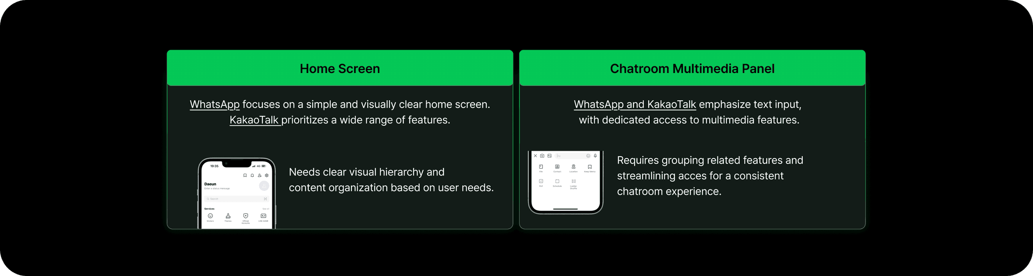
Camera and album placed at the top,
reducing input space and causing mistouches
Inconsistent icon styles with unnecessary frames
Before
LINE Analysis Project
Project Category
Personal Project
Project Period
25.03 ~ 04
Implementation Level
Research 100% – Analysis 100% – Redesign 100%
Grouped multimedia features in one section,
ensuring more space for typing
Unified icon style with simplified,
circular buttons for a cohesive look
After

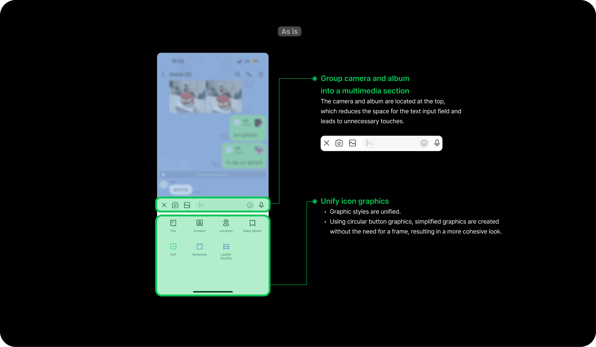
Improvement 03
Chatroom Multimedia Layout Improvement
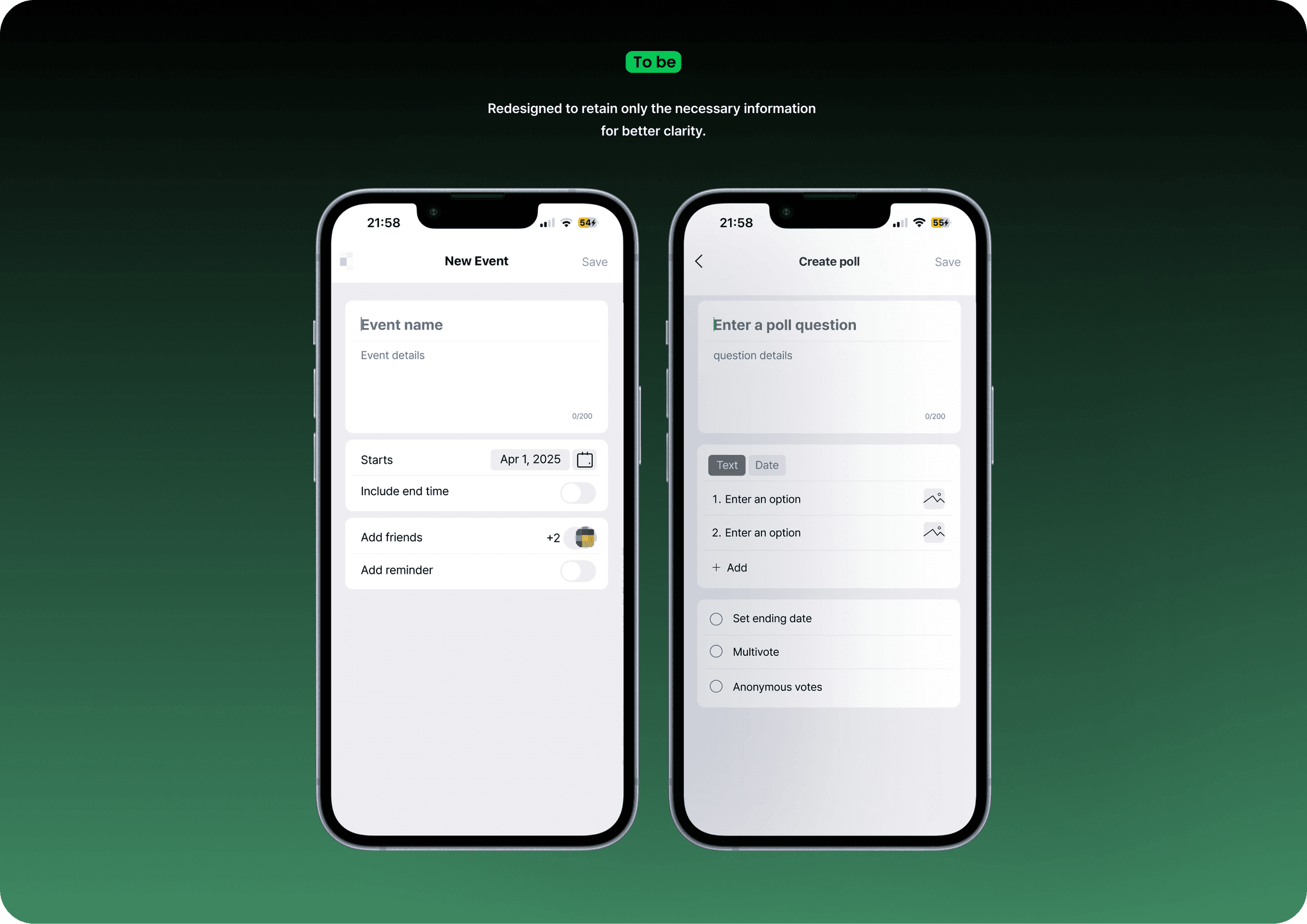
Improvement 04
Chatroom – Event Scheduling Improvement

LINE Analysis Project
Project Category
Personal Project
Project Period
25.03 ~ 04
Implementation Level
Research 100% – Analysis 100% – Redesign 100%
Unnecessarily long scroll and
inconsistent UI between related screens
Before
LINE Analysis Project
Project Category
Personal Project
Project Period
25.03 ~ 04
Implementation Level
Research 100% – Analysis 100% – Redesign 100%
Streamlined layout with unified structure and
reduced input steps for clarity
After
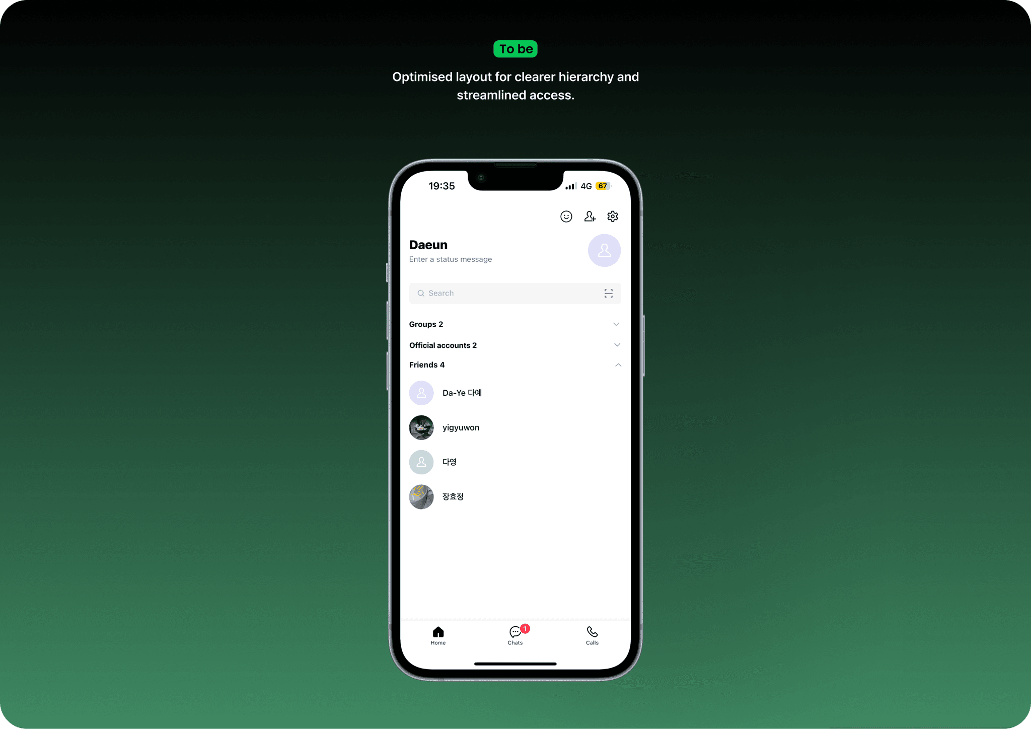
Improvement 05
Home Screen Optimization
LINE Analysis Project
Project Category
Personal Project
Project Period
25.03 ~ 04
Implementation Level
Research 100% – Analysis 100% – Redesign 100%
Layout lacks clarity
in reflecting content hierarchy and relevance.
Before
LINE Analysis Project
Project Category
Personal Project
Project Period
25.03 ~ 04
Implementation Level
Research 100% – Analysis 100% – Redesign 100%
Optimised layout for clearer hierarchy and
streamlined access.
After

What I learned
Improving an existing product while maintaining its usability is more complex
than designing a new experience from scratch.
01
02
Core communication features should align with users’ established
behavioural patterns and maintain familiar interaction patterns.
03